Typography plays a pivotal role in shaping a brand's identity and conveying its message to the world. Beyond the aesthetics, typography is the visual language that can evoke emotions, establish credibility, and communicate a brand's personality. The choice of fonts, styles, and spacing can instantly signal whether a brand is modern and innovative, traditional and trustworthy, or somewhere in between.
Consistency in typography across various brand materials, from logos to marketing collateral, fosters recognition and builds trust among customers. In essence, typography isn't just about letters and characters; it's the voice of a brand, a silent yet powerful ambassador that helps create a lasting and memorable impression.
Our brand typographies
In Socrates we use a variety of fonts and each one has a very important and defined use, this guide will help you differentiate them and use them appropriately
Our brand fonts are Staatliches, DM Sans and Noto Sans SC.
Headlines
For headlines, titles and other large texts this table will give you guidance.
We use a combination of Staatliches and DM Sans.
Headline
Sample
Properties
H1
Welcome!
font-family: Staatliches;
font-size: 80~100px;
font-style: normal;
font-weight: 400;
line-height: 110%;
H2
Think, debate!
font-family: DM Sans;
font-size: 30~50px;
font-style: normal;
font-weight: 700;
line-height: normal;
letter-spacing: -2px;
H3
Want to read our whitepaper?
font-family: DM Sans;
font-size: 27px;
font-style: normal;
font-weight: 700;
line-height: normal;
letter-spacing: -1px;
H4
Join the discussion on Discord
font-family: DM Sans;
font-size: 22px;
font-style: normal;
font-weight: 400;
line-height: normal;
Content
For different types of content copy, this table will give you proper guidance.
We use a combination of DM Sans and Noto Sans SC
Headline
Sample
Properties
Body copy
The quick brown fox jumps over the lazy dog
font-family: DM Sans;
font-size: 16~22px;
font-style: normal;
font-weight: 400;
line-height: normal;
Eyebrow
1st Principle
font-family: DM Sans;
font-size: 28px;
font-style: normal;
font-weight: 400;
line-height: normal;
Button labels
Sign up using wallet
font-family: Noto Sans SC;
font-size: 18px;
font-style: normal;
font-weight: 700;
line-height: normal;
Quotes
“Stay hungry. Stay foolish.”
font-family: DM Sans;
font-size: 16~22px;
font-style: italic;
font-weight: 400;
line-height: normal;
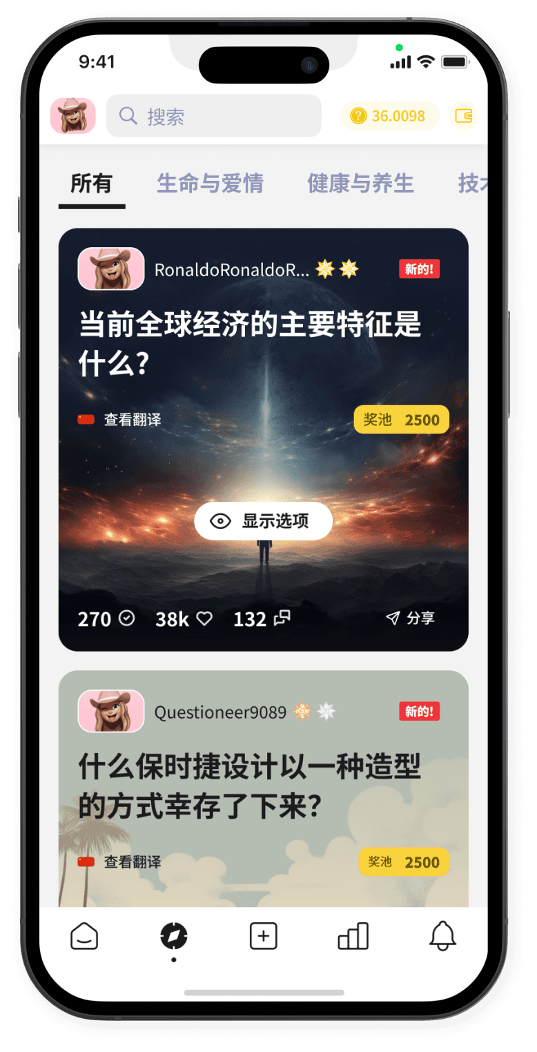
Product / App
For our products and and apps and any other UI text that is not a website we use Noto Sans SC.
We use this font as it has a big variety of weights in Chinese so it has a good contrast.

Here are all the different weights for Noto Sans SC font with some letter examples.
Thin
Where am I going?
我要去哪里?
AaBbDdEeGgMmOoRrSs
1234567890!?()[]{}@$#%
Light
Where am I going?
我要去哪里?
AaBbDdEeGgMmOoRrSs
1234567890!?()[]{}@$#%
DemiLight
Where am I going?
我要去哪里?
AaBbDdEeGgMmOoRrSs
1234567890!?()[]{}@$#%
Regular
Where am I going?
我要去哪里?
AaBbDdEeGgMmOoRrSs
1234567890!?()[]{}@$#%
Medium
Where am I going?
我要去哪里?
AaBbDdEeGgMmOoRrSs
1234567890!?()[]{}@$#%
Bold
Where am I going?
我要去哪里?
AaBbDdEeGgMmOoRrSs
1234567890!?()[]{}@$#%
Black
Where am I going?
我要去哪里?
AaBbDdEeGgMmOoRrSs
1234567890!?()[]{}@$#%
Advertising & Comms
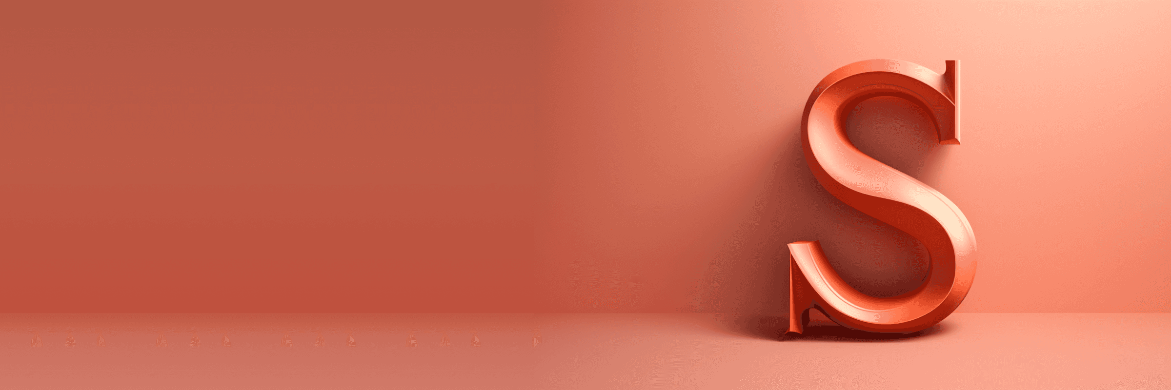
We have a special font that our CEO loves (we too!) and honestly is such an elegant font that the design team is happy to include it as an exception with very specific uses cases that we'll explain below.
This font is only allowed to be used for advertising and printed media such as invitations, flyers, etc…
Due to it's creative nature it can't and shouldn't be used for user interfaces or long paragraphs of texts in printed formats.
It works very well for titles and hero headlines, also for titles on video produced material.

Example of one of our promotional posters.
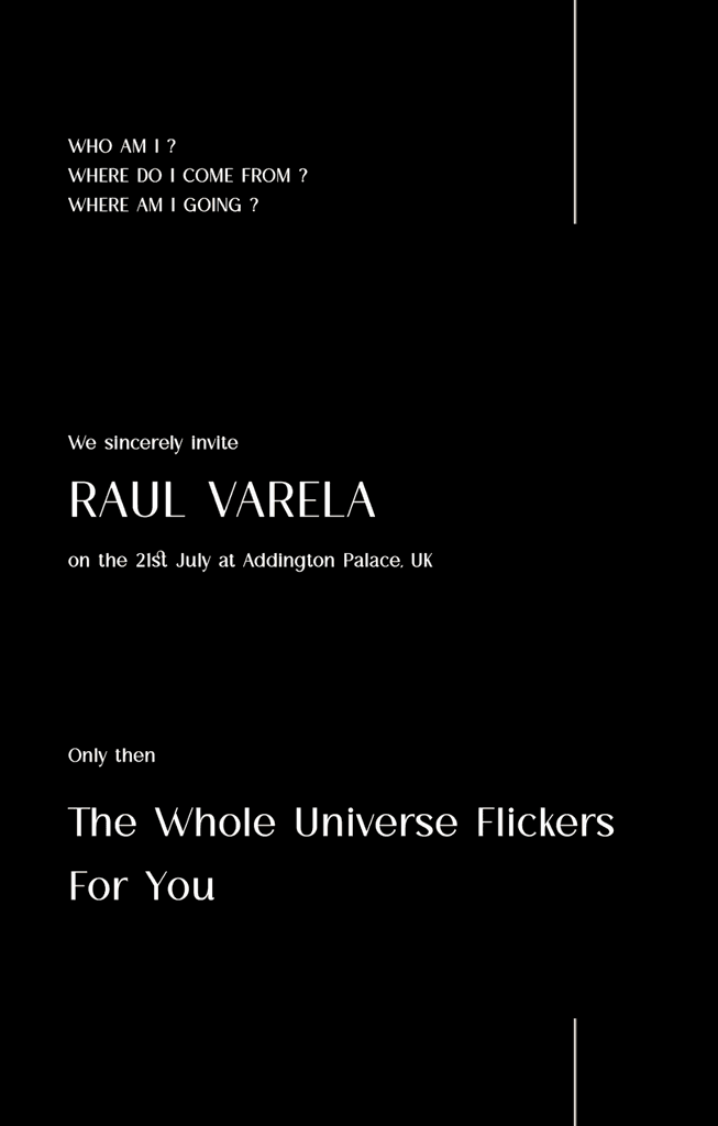
Example of printed/digital event invitation.
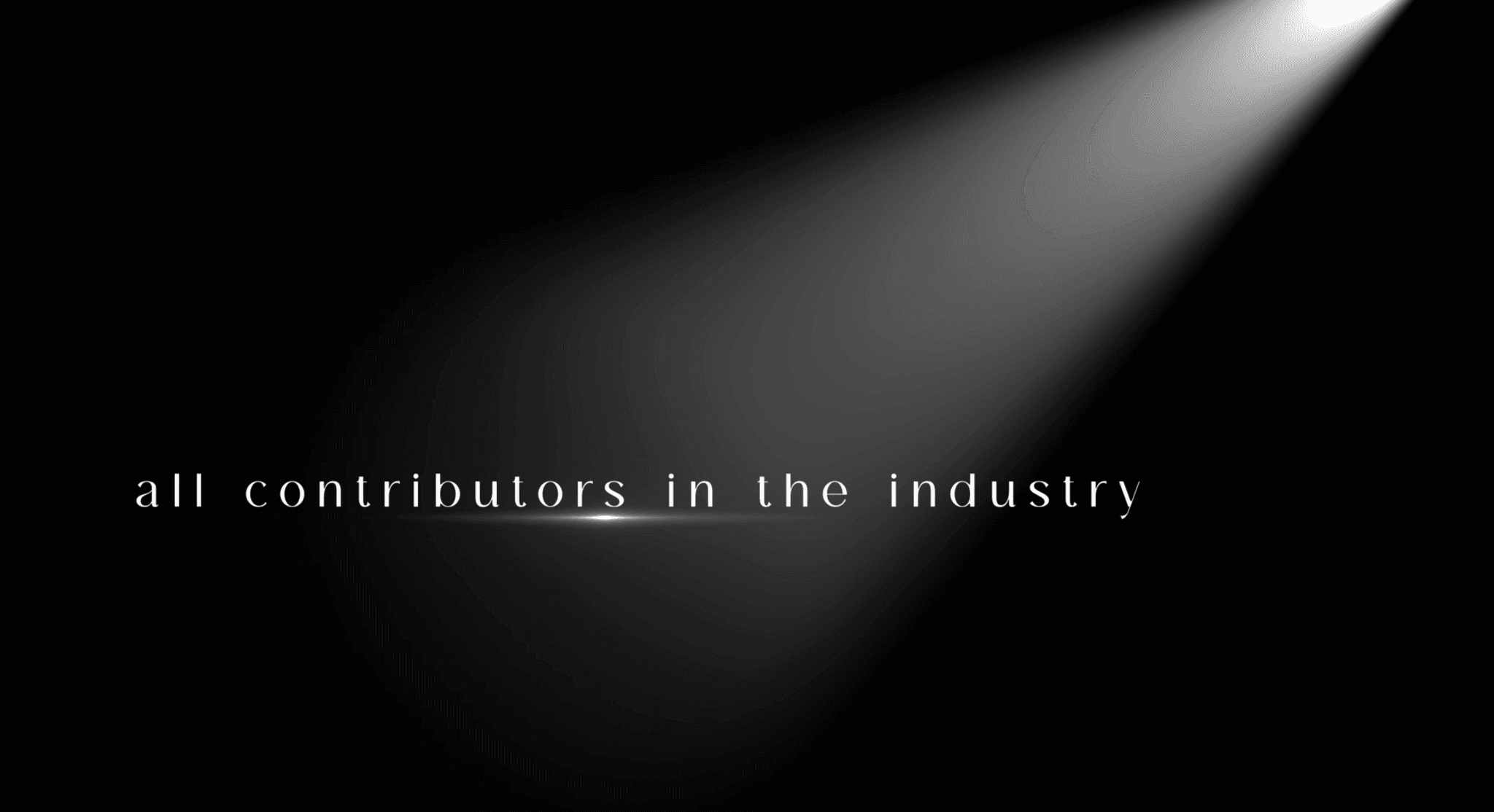
Still frame from one of our promotional videos.