Our logo is the face of our company, if this is the reason that brought you here, please download the basic logo kit below.
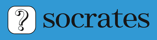
Primary Logo
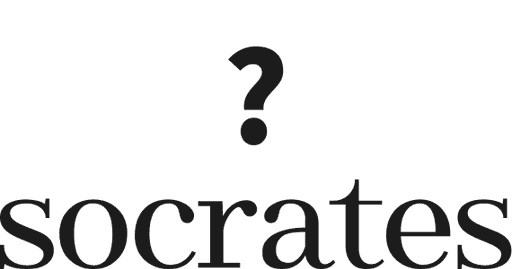
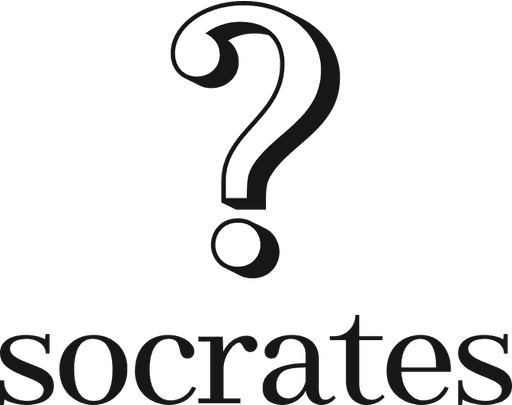
Our socrates logo is form of 2 parts, a logo mark with our recognisable ? symbol and a logotype with the name of our company. They can also be used separatedly and together, continue reading to learn about the best uses.
Pronounced: so·kruh·teez
Secondary Logo
We use the proper name Socrates in small caps as well in this secondary version, despite being small caps, on written communications we should always capitalise Socrates name.
The font used as a base is Abhaya Libre but it has been modified to give it a unique look and feel.

This version of the logo works great on places where the vertical height is more limited so we use it for example on our website and app headers, email signatures, etc… where the vertical layout (primary) doesn't fit properly.
Tertiary Logo
The tertiary layout is our logomark representing our recognisable question mark (?) symbol.

We mainly use this version of our logo when there's no enough space or when we require to fit into a small space, for example for app logos in the App Store.
We also use this logo on its own to create more mystery around our brand as it doesn't contain the brand name so it's good to use on 'coming soon' pages or more guerrilla type of advertising.
Construction guide and clear space
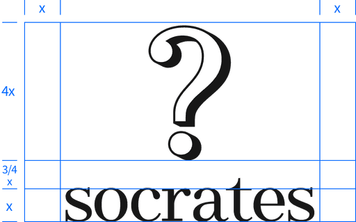
For the Socrates logo (primary) we can take the height of the letter O as 'x' we can use the following guide to measure and recreate it.
For the Socrates logotype (secondary), we can take the height of the letter O as 'x' we can use the following guide to measure and recreate it.

Minimum size
It's important that when representing our brand through a logo we respect a minimum size so we can ensure the logo is well visible.
These sizes are for printed and digital formats.
On screen 134px
In print 60 mm
In print 6mm
On screen 18px
Wrong uses
When applying Socrates brand you'll have to pay attention to do it correctly, here are some examples of badly applied branding or incorrect uses of our brand material.
Be mindful of details and always reach out to our design team if you have any question or doubt of how to proceed.
Use wrong aspect ratio / proportion
Wrong use of colours

Incorrect layout use

Use of pixelated or low resolution logo
Incorrect background colour
Incorrect typography or ? symbol