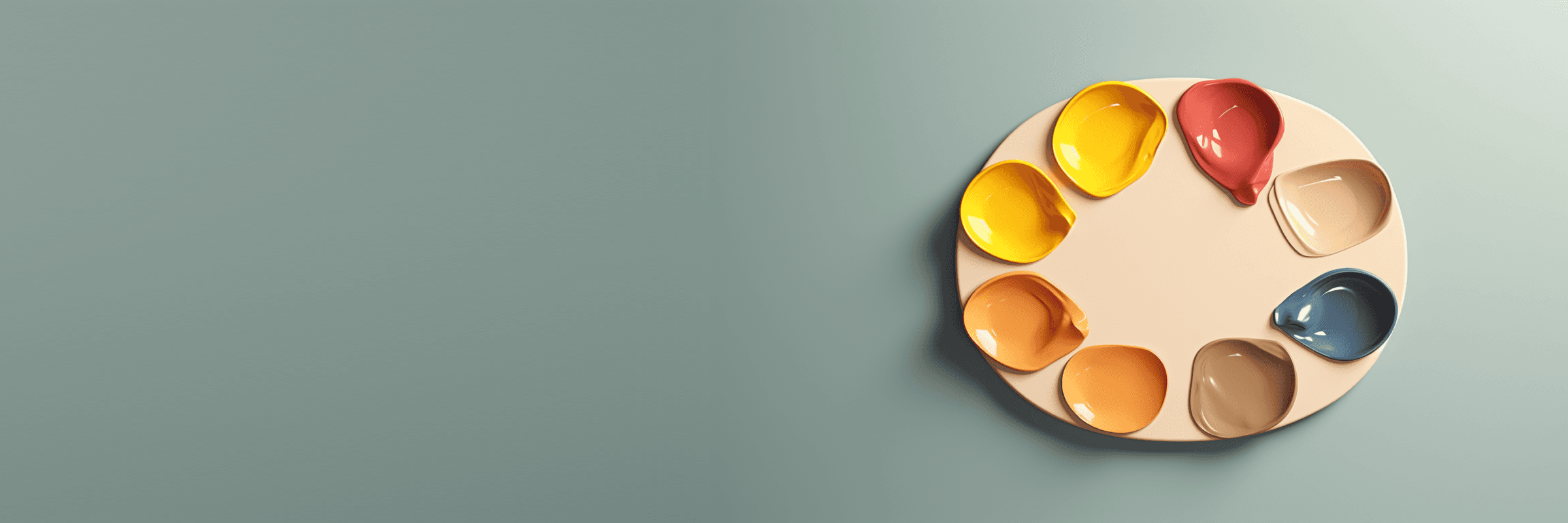
Colours allow a more expressive and fun brand communication. Our logo uses a basic black and white primary palette but we have plans to make Socrates the most customisable app in the world, allowing users to create and use their own colour themes and backgrounds.
Our brand colours
In Socrates we mainly use 2 brand colours, a shade of black (almost black) and a pure white.
We chose this combination as it's highly regarded as a good combination to make brands look elegant, sophisticated and formal.
Primary scheme
Our socrates logo is form of 2 parts, a logo mark with our recognisable ? symbol and a logotype with the name of our company. They can be used separtedly and together, continue reading to learn about the best uses.


Secondary scheme
Our socrates logo is form of 2 parts, a logo mark with our recognisable ? symbol and a logotype with the name of our company. They can be used separtedly and together, continue reading to learn about the best uses.


